


If you’re a publisher, you probably know the importance of providing a seamless ad experience to your users, regardless of the device they’re using. With the majority of web traffic now coming from mobile devices, it’s crucial to make sure your ads are responsive and look great on any screen size.
That’s where Google Ad Manager comes in – it’s a powerful tool that makes creating and managing responsive ads a breeze.
In this blog post, we’ll guide you through the process of setting up Google Ad Manager to run responsive ads on your site, making it easier for you to deliver an optimal ad experience to your users across different devices. Let’s dive in!
Table of Contents
What are Responsive Ads?
Responsive ads are designed to automatically adjust their size and appearance to fit the screen of any device – be it desktop, mobile, or tablet.
This ensures users a seamless and consistent ad experience, regardless of their device. For instance, imagine you have a display banner ad with dimensions of 970×90 or 728×90. If a user switches from a desktop to a mobile device, the ad will automatically resize to fit the smaller screen.
The magic of responsive ads lies in their adaptability. Google Ad Manager helps to adjust the size and appearance of the ad creative to fit the available ad space on a given device. This means a responsive ad could appear as a native ad on one page and a dynamic text ad on another.
Responsive ads also offer flexibility in terms of ad unit sizes. For example, if a browser’s size is larger than 1024×768, an ad with dimensions of 970×90 or 728×90 may be served. If the browser’s size is smaller than 1024×768, a 468×60 ad might be displayed instead.
How to Create Responsive Ads with Google Ad Manager
Step 1: Generate Google Publisher Tags
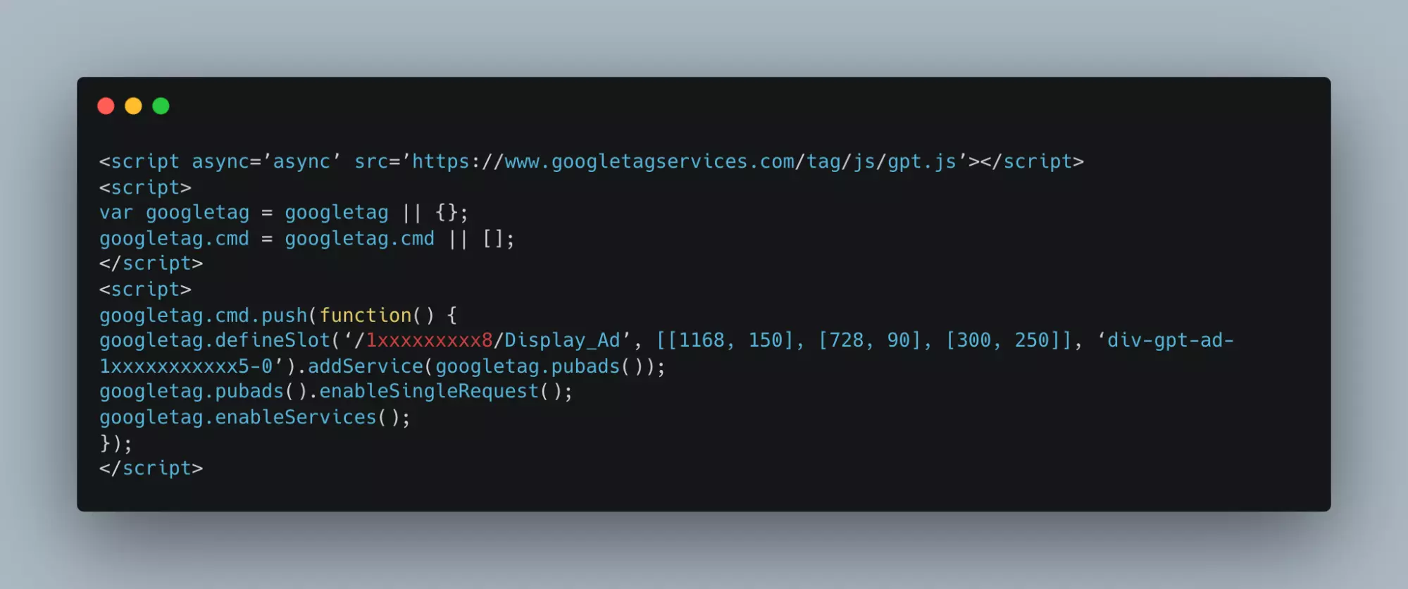
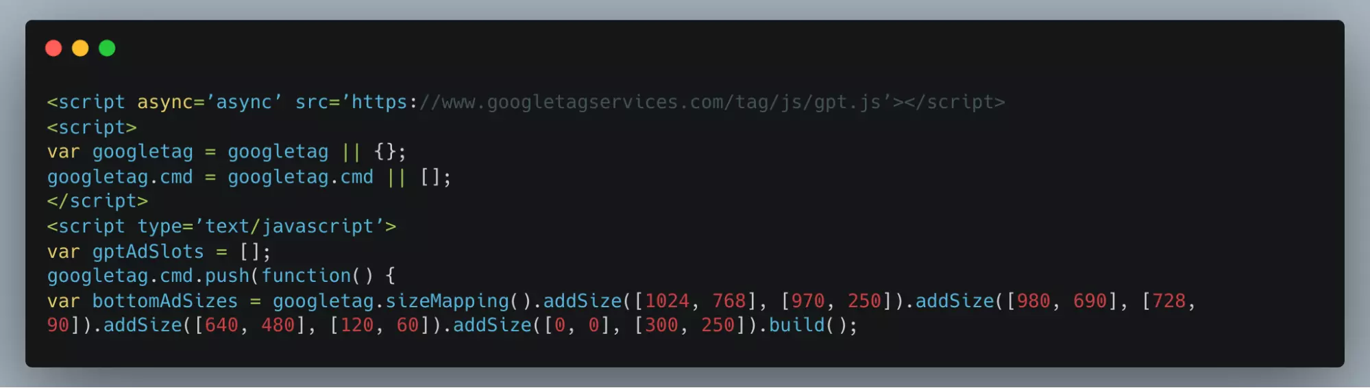
Google Publisher Tags (GPT) enable publishers to build responsive ads that adapt to the user’s device screen size. They help swap out ad tags based on the device’s screen size. To get started, generate GPT for ad units while creating line items. Here’s a sample GPT head tag and body tag:
A simple GPT Head tag looks like the following:
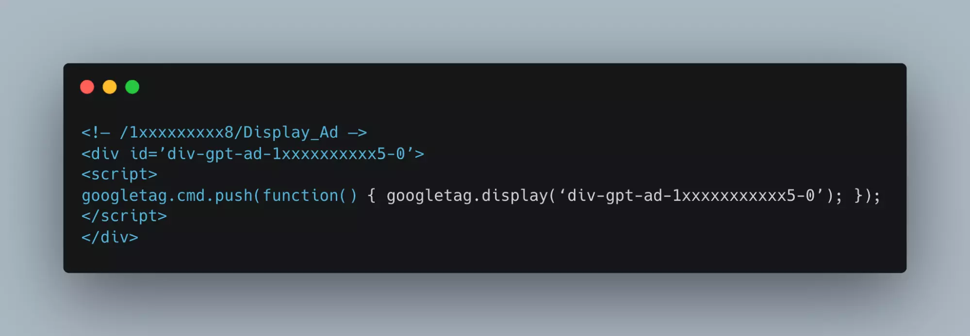
And a sample of the body tag is given below:
Step 2: Create the Ad Size Mapping
Size mapping is the process of designing responsive ads for Google Publisher Tags. It involves two main steps:
- `.sizeMapping()` function maps ad sizes with the browser’s size.
- `.defineSizeMapping()` function implements the mapping defined by the `.sizeMapping()` function, instructing Google Ad Manager where the defined ad sizes will be served.
Here’s an example of what sizeMapping snippet looks like, and we will use this example to create ad size mapping below.
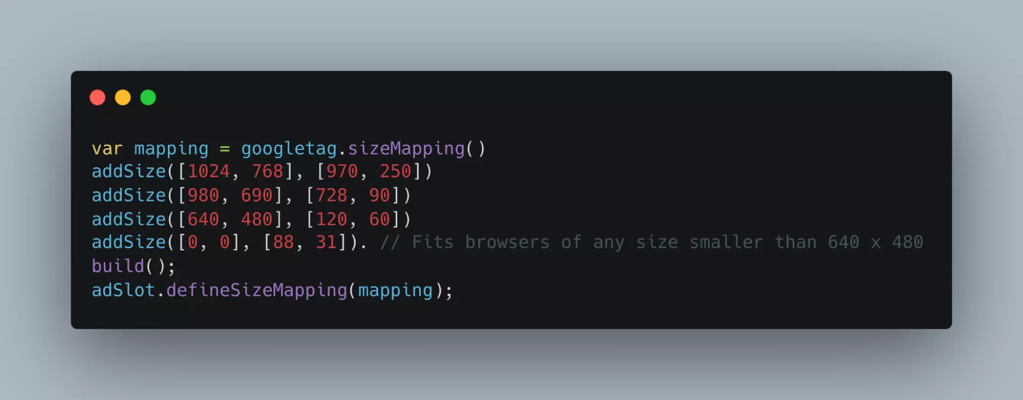
Here, the first block of addsize( ) i.e. [1024, 768] displays the browser’s size, and the second [970, 250] displays the ad size.
This mapping implies that if a browser’s size is equal to or smaller than 1024×768, then the size of the ad will be 970×250.
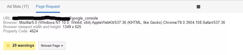
Sidenote: Use Google Publisher Console’s Page Request tab to find out the browser’s size of the device (Browser viewport width and height).
Google Publisher Tags detects the browser size automatically and uses the size mapping that makes the ad fit into the viewport of the browsers.
In case you want to create a default mapping, then [0,0] is the size that tells the server the ad size can be fit for any browser.
Consider a situation where you forgot to mention what size of an ad should serve if the browser’s viewport is smaller than 640×480.
In such a case, [0,0] mapping serves the default ad size that makes the ad fit into any device the size is not mapped.
GPT with ad size mapping:
//If browser viewport is more than 1024×768 show creative banner 970×250.
If the browser viewport is more than 980×690, show the creative banner 728×90. If the browser viewport is less than 640×480 show a creative banner 120×60
Further, if you want not to show ads on a particular device, you can suppress the ads for other formats. However, you need to make a few changes in the code that are given below.
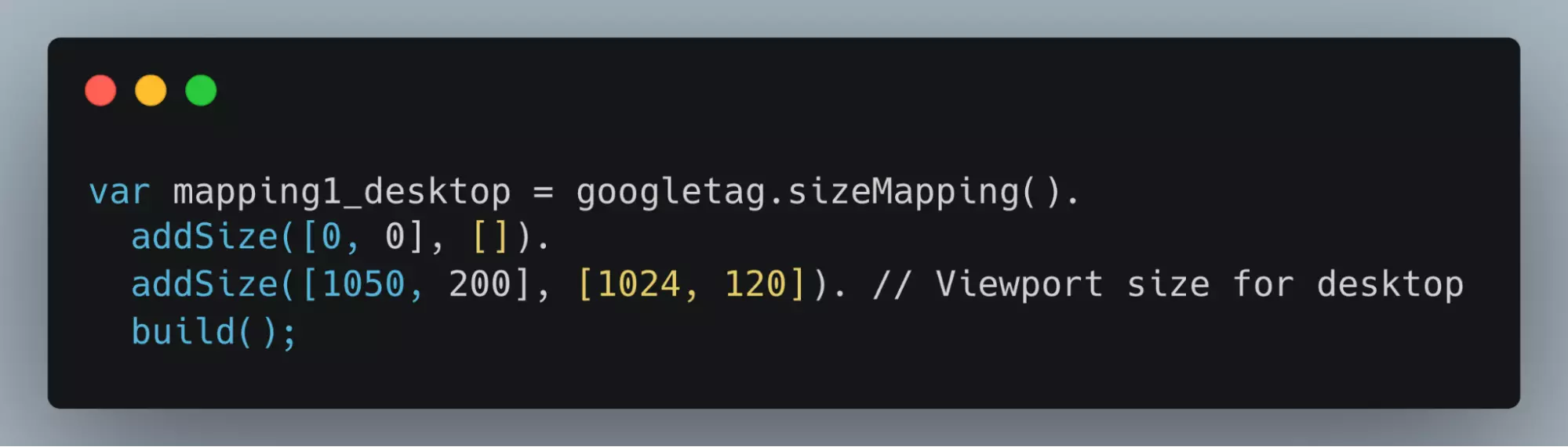
Step #2A: Add the script to display ads to desktop visitors only.
//This mapping will only display ads when the user is on a desktop-sized viewport
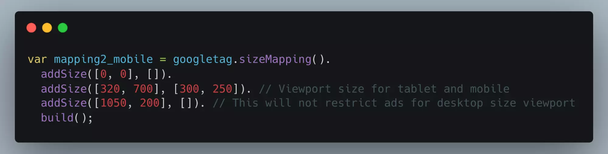
Step #2B: Add this script to display ads to mobile or tablet users only.
//This mapping will only display ads when the user is on a mobile or tablet-sized viewport
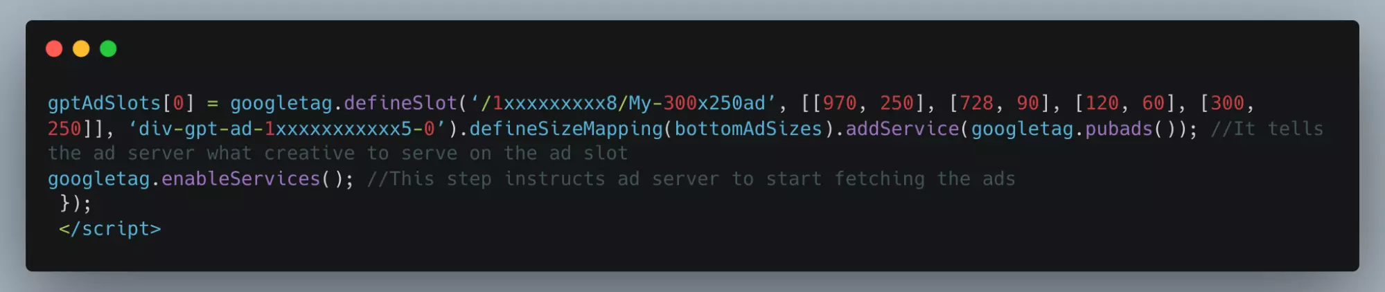
Step 3: Link the Size Mapping to Google Ad Manager Ad Units
Now that you have mapped the ad sizes and implemented GPT on your site, it’s time to link the mapping to the ad slots in Google Ad Manager. Add the following code to the GPT header tag:

After completing the steps, a GPT that can serve responsive ad units should look like the one below:

//If browser viewport is more than 1024×768 show creative banner 970×250.
If the browser viewport is more than 980×690, display the creative banner 728×90 if the browser viewport is less than 640×480 display the creative banner 120×60.
In summary, creating responsive ads with Google Ad Manager involves three main steps: generating Google Publisher Tags, creating the ad size mapping, and linking the size mapping to Google Ad Manager ad units. By following these steps, you can ensure a seamless ad experience for users across different devices and screen sizes.
Tips for Optimizing Responsive Ads
Optimizing responsive ads is crucial to ensure a seamless user experience and increase ad revenue. This section will discuss some best practices for designing and implementing responsive ads and the importance of testing ads on various devices and screen sizes.
Use high-quality and relevant ad creatives: The quality and relevance of your ad creatives play a significant role in determining the success of your ad campaigns. High-quality images and engaging text can improve click-through rates and conversions, increasing revenue.
Keep ad sizes consistent with industry standards: Using standard ad sizes such as 300×250, 728×90, and 160×600 can improve fill rates and increase the likelihood of your ads being displayed across various ad networks.
Prioritize mobile-first design: With a significant percentage of users accessing content on mobile devices, it’s essential to prioritize mobile-first design when creating responsive ads. This means designing great ads on small screens and scaling up for larger devices.
Use responsive design techniques: To ensure your ads adapt well to different devices and screen sizes, utilize responsive design techniques such as fluid grids, flexible images, and media queries. These techniques help create ads that adjust seamlessly to varying device sizes.
Test ads on various devices and screen sizes: It’s important to test your responsive ads on various devices and screen sizes to identify any issues and ensure a consistent user experience. Use device emulators, browser resizing tools, and real devices to verify your ads render correctly across different environments.
Monitor ad performance and optimize accordingly: Regularly monitor your ad campaigns’ performance using analytics tools and make data-driven optimizations. This could involve adjusting ad sizes, placements, or targeting options to maximize revenue.
By following these best practices and emphasizing the importance of testing, you can optimize your responsive ads and enhance the user experience across different devices and screen sizes.
Wrapping Up: Responsive Ads for Seamless User Experience
Navigating the world of digital advertising demands adaptability, strategic thinking, and a keen understanding of your audience’s behavior. In this blog, we’ve demystified the process of creating and optimizing responsive ads using Google Ad Manager.
The essence of responsive ads lies in their ability to provide a seamless and engaging experience across a variety of devices. Utilizing these adaptive ads ensures an optimal viewing experience and builds a robust connection with your audience, regardless of the device used.
This is not just about compliance with modern digital standards; it’s a strategic move towards future-proofing your advertising efforts. The enhanced user satisfaction, improved ad performance, and potential for increased revenue underscores the pivotal role of responsive ads in the current and future digital advertising landscape.
In essence, the key to thriving in digital advertising lies in your ability to adapt and evolve. Responsive ads are not just a feature of this evolution; they are at the heart of it. Embrace this shift, and you’ll be well on your way to offering a superior ad experience that drives engagement and growth.